CrossPlot Cross Sections
Plotting cross-sectional data
This tutorial describes a way to visualize multiple dimensions of cross-sectional data using CIQ.CrossSection. It demonstrates some of the functionality of sample-template-scatterplot.html, which you can find in the examples/templates folder along with various ready-made templates for CrossPlot use cases.
Prerequisites
Requires ChartIQ v8.7.0 or later with the CrossPlot plug-in option.
Required modules
// Reference the main ChartIQ library.
import { CIQ } from "./js/standard.js";

// Reference the CrossPlot plug-in.
import "./plugins/crosssection/core.js";
Create a data source
The data set is composed of 15 clients that are organized into three portfolios (A, B, and C). We want to visualize the portfolio, touchpoints, client score, and total customer value for each client on a particular date.
The base chart type for cross-sectional analysis is a scatterplot, which displays the relationship between two variables on a two-dimensional Cartesian plane. By adding additional properties to the data points, we can visualize all five variables in a single chart.
var quotes = [
	{
		"DT": "2022-12-08T05:00:00.000Z",
		"DataSet": {
			"Client 1": {
				"name": "Beatles & Sons",
				"portfolio": "A",
				"touchpoints": 32,
				"score": 18.09294,
				"tcv": 2136
			},
			"Client 2": {
				"name": "Led Zeppelin Holdings",
				"portfolio": "A",
				"touchpoints": 69,
				"score": 5.27148,
				"tcv": 200
			},
			"Client 3": {
				"name": "Queen Wholesale",
				"portfolio": "B",
				"touchpoints": 94,
				"score": 8.14696,
				"tcv": 4543
			},
			"Client 4": {
				"name": "Pink Floyd Trading",
				"portfolio": "B",
				"touchpoints": 172,
				"score": 8.01689,
				"tcv": 2618
			},
			"Client 5": {
				"name": "Rolling Stones International",
				"portfolio": "C",
				"touchpoints": 254,
				"score": 23.84789,
				"tcv": 4354
			},
			"Client 6": {
				"name": "AC/DC America",
				"portfolio": "C",
				"touchpoints": 216,
				"score": 15.89953,
				"tcv": 2462
			},
			"Client 7": {
				"name": "Eagles Inc",
				"portfolio": "A",
				"touchpoints": 220,
				"score": 10.59312,
				"tcv": 2840
			},
			"Client 8": {
				"name": "Metallica Brokerage",
				"portfolio": "A",
				"touchpoints": 36,
				"score": 6.6223,
				"tcv": 1590
			},
			"Client 9": {
				"name": "Guns N' Roses & Co",
				"portfolio": "C",
				"touchpoints": 52,
				"score": 21.87604,
				"tcv": 8995
			},
			"Client 10": {
				"name": "Aerosmith Partners",
				"portfolio": "A",
				"touchpoints": 86,
				"score": 2.31492,
				"tcv": 1418
			},
			"Client 11": {
				"name": "Fleetwood Mac LLC",
				"portfolio": "B",
				"touchpoints": 257,
				"score": 8.95966,
				"tcv": 8778
			},
			"Client 12": {
				"name": "Linkin Park & Associates",
				"portfolio": "B",
				"touchpoints": 18,
				"score": 14.35688,
				"tcv": 1467
			},
			"Client 13": {
				"name": "Red Hot Chili Peppers Ltd",
				"portfolio": "B",
				"touchpoints": 237,
				"score": 51.50764,
				"tcv": 2618
			},
			"Client 14": {
				"name": "Maroon 5 Group",
				"portfolio": "A",
				"touchpoints": 286,
				"score": 48.35886,
				"tcv": 2937
			},
			"Client 15": {
				"name": "Bon Jovi Financial",
				"portfolio": "A",
				"touchpoints": 69,
				"score": 45.23528,
				"tcv": 1177
			}
		}
	},
];
Configuration
Create a config object to customize the default configuration.
Basic scatterplot
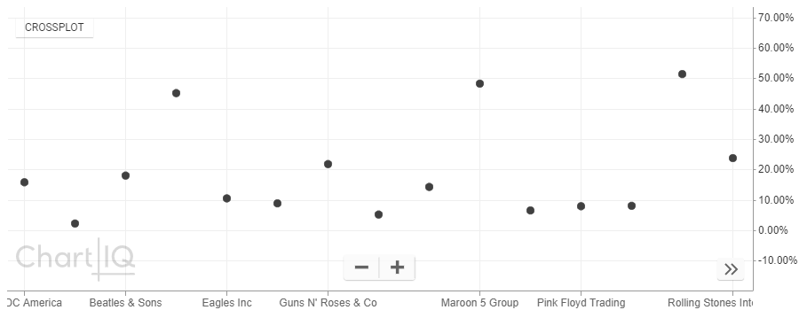
By creating a basic scatterplot with name in the x-axis and score in the y-axis:
const config = {
		useQuotefeed: false,
		dataSetField: "DataSet",
		initialSymbol: "crossplot",
		xaxisField: "name",
		yaxisField: "score",
		groupField: "name",
		fieldsToFormatAsPercent: ["score"],
		showUpdateStamp: false
	};
we can compare scores by client:

Grouping data points
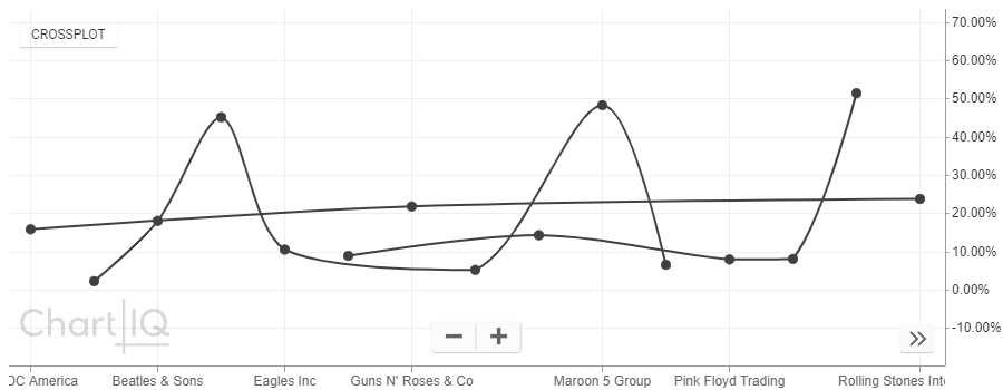
To visualize client/portfolio associations, group the data points by portfolio:
const config = {
	useQuotefeed: false,
	dataSetField: "DataSet",
	initialSymbol: "crossplot",
	xaxisField: "name",
	yaxisField: "score",
	groupField: "portfolio",
	fieldsToFormatAsPercent: ["score"],
	showUpdateStamp: false
};
which adds lines connecting members of each portfolio:

While this chart clearly shows how clients are distributed among portfolios, there are some potential drawbacks to using connecting lines:
- There is no indication of which portfolio is which.
- Connecting lines can make it harder to read shapes.
- Connecting lines can suggest sequential connectivity that may not be desirable for a particular data set visualization.
Shape property
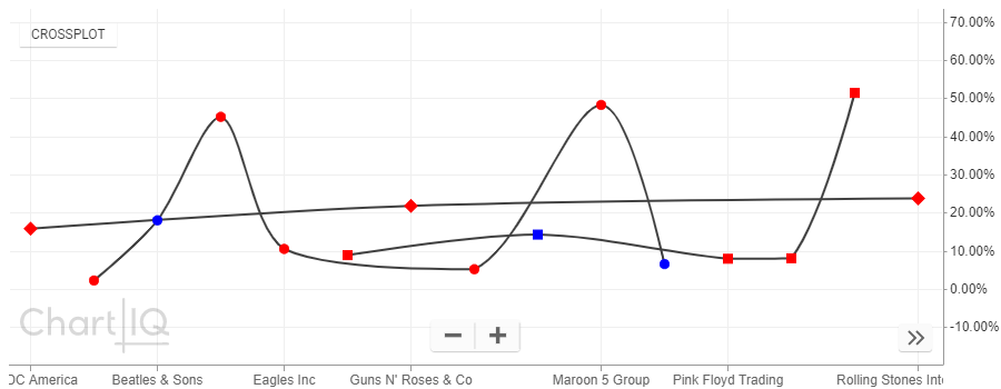
To indicate which portfolio is which, add the shape property to the data points:
const config = {
	useQuotefeed: false,
	dataSetField: "DataSet",
	initialSymbol: "crossplot",
	xaxisField: "name",
	yaxisField: "score",
	groupField: "portfolio",
	fieldsToFormatAsPercent: ["score"],
	showUpdateStamp: false,
	pointAttributes: (entity) => {
		const mapPortfolio = { A: "circle", B: "square", C: "diamond" };
		const result = {
			shape: mapPortfolio[entity.portfolio]
		};
		return result;
	}
};
which maps data point shape to a particular portfolio:

Color property
Next, display the relative number of client touchpoints by adding the color property:
const config = {
	useQuotefeed: false,
	dataSetField: "DataSet",
	initialSymbol: "crossplot",
	xaxisField: "name",
	yaxisField: "score",
	groupField: "name",
	fieldsToFormatAsPercent: ["score"],
	showUpdateStamp: false,
	pointAttributes: (entity) => {
		const mapPortfolio = { A: "circle", B: "square", C: "diamond" };
		const result = {
		shape: mapPortfolio[entity.portfolio]
		color: entity.touchpoints > 50 ? "red" : "blue",
		};
		return result;
	}
};
so that clients with more than 50 touchpoints have red data points and those with less than 50 have blue data points:

Size property
Lastly, use the size property to show relative TCV by adjusting it's parameters where
entity.tcv / 4000sets the value that produces the maximum marker size2sets the maximum marker size0.8sets the minimum marker size
const config = {
	useQuotefeed: false,
	dataSetField: "DataSet",
	initialSymbol: "crossplot",
	xaxisField: "name",
	yaxisField: "score",
	groupField: "name",
	fieldsToFormatAsPercent: ["score"],
	showUpdateStamp: false,
	pointAttributes: (entity) => {
		const mapPortfolio = { A: "circle", B: "square", C: "diamond" };
		const result = {
			shape: mapPortfolio[entity.portfolio],
			color: entity.touchpoints > 50 ? "red" : "blue",
			size: entity.isCurrent
				? Math.max(Math.min(entity.tcv / 4000, 2), 0.8)
				: 0.5,
		};
		return result;
	}
};
to obtain an optimal range of sizes for the data points:
Conclusion
This tutorial has demonstrated one way to configure CIQ.CrossSection to visualize multiple variables for cross-sectional visualizations using data point position, shape, size, color, and grouping properties.
